
Can you provide a Resource Guide for Gel Plate printing?
- Su France

- Nov 26, 2025
- 8 min read
Updated: Apr 20


Botanical Gel Plate Printing: A Resource Guide


Discover the art of botanical gelli plate printing using plants and natural textures.
This guide will show you some of the resources I use for my monoprints using leaves, flowers and found materials from a garden.


After years of experimenting with botanical gel plate printing (and teaching a fair few of students!), I've discovered that success lies not just in the materials we choose, but in how we approach the whole creative process.
Resources
The Gel Plate itself
I use the round plates, this smaller rectangular one and my largest is 30cm x36cm. Yes, they are quite expensive, by look after them and they will serve you well for a long time.
Store upright like a book - Keep it standing vertically to prevent dust settling on the surface.
Season with baby oil - Apply a thin layer occasionally to keep it conditioned. Clean with diluted washing-up liquid spray.
Avoid extreme temperatures - Keep away from direct sunlight and heat sources to prevent warping.
Store with a protective sheet - Cover with baking parchment between uses to keep it clean. I also sometimes use copier paper to take out air bubbles.
10 simple tips for the Printing session
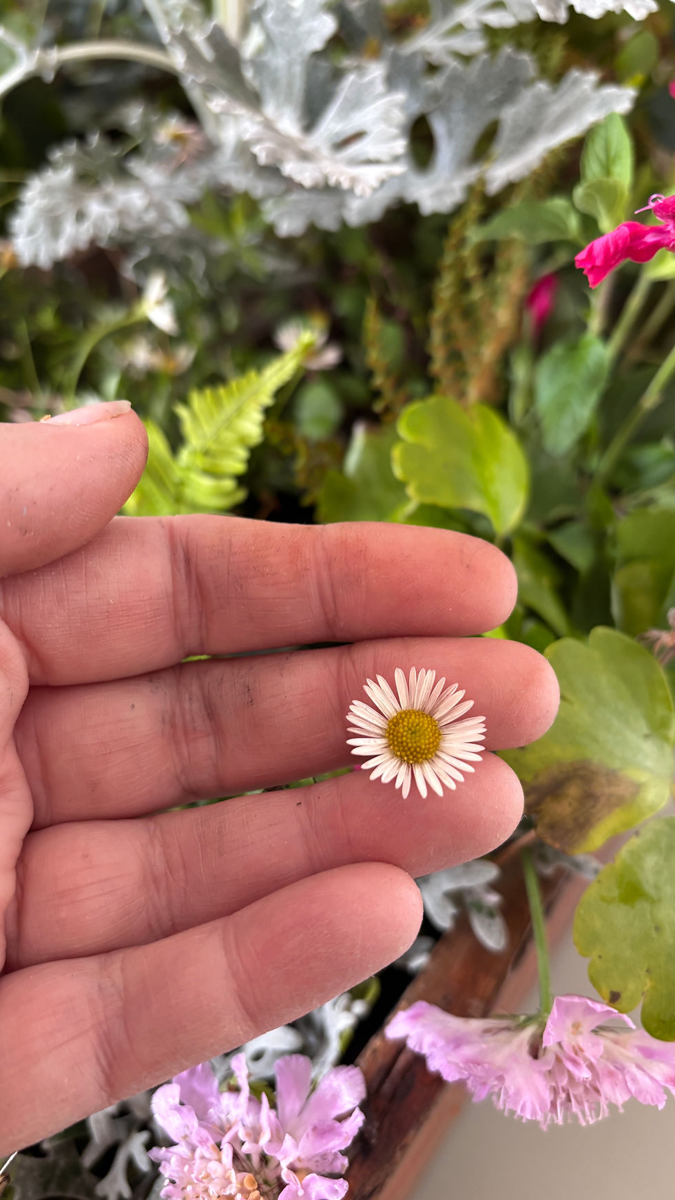
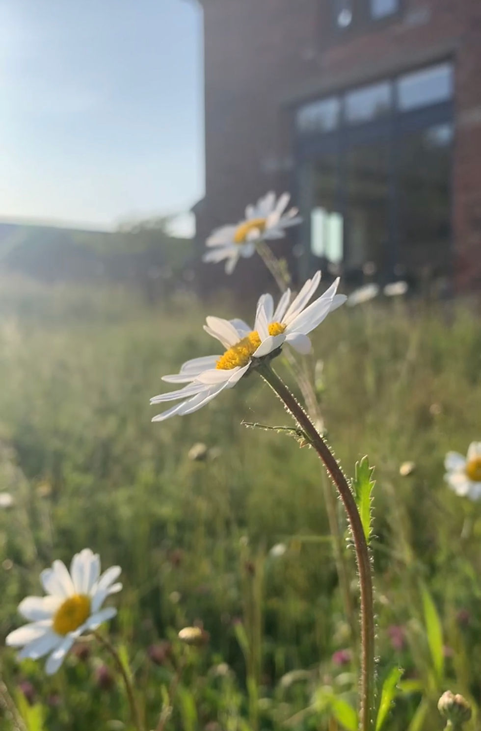
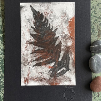
1. Choose the right plants - Fresh, flat (ish) leaves and flowers work best for me. Ferns, herbs, and pressed flowers give crisp impressions, while thick or waxy leaves may not transfer well if the paper is thick and 'tents' over the plant material. Sometimes it's best to take off any unwanted background ink with wet strength tissue. I have found though, when layering these first backgrounds, it can produce interesting shapes which then give interesting overlaps with future layers.

2. Work quickly on a recommended gel plate- Some inks have a limited working time before the paint starts to dry, so have all your botanicals laid out in a compostion you enjoy and ready before you start rolling paint. I encourage first playing with 'open' inks as they stay wet or workable for longer. I use Golden Open and particulary like the palette of the Landscape colours set along with the cheaper starter set you will find here.
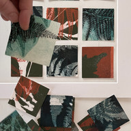
3. Layer your prints - Don't throw away prints you think are unsuccessful - use them as a base layer for additional colours and botanical impressions to build depth and complexity. Paper is a precious commodity and so I use up paper from all sorts of sources including copier paper and envelopes received through the post. However, not all pull prints successfully, so my go to cartridge is this one. A lovely student (thanks Anne) introduced me to a Japanese Awagami paper KITAKATA. There is a link to the cream one here but alternative colours are available too. Its a gentle, soft paper and the edges produced are divine!.
4. Vary your pressure - Light pressure captures delicate leaf veins, while firm pressure gives bold silhouettes. Experiment with rolling over botanicals with a roller/brayer versus just laying them on the paint and feeling the shapes with the flats of fingers.
5. Try different paint consistencies - Slightly thinned acrylic paint flows around botanical details in a different way, while thicker paint creates more textured, raised impressions. You can use thinner. Use it sparingly when adding to acrylic paints, starting at about 10 parts paint to 1 part OPEN thinner. I also use GAC 100 as a thinner and it has other properties which you may read about here.
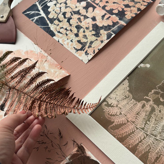
6. Remove botanicals carefully - Peel leaves off slowly and in one direction to avoid smudging. Tweezers help with delicate specimens but I like to use the stem of another plant so that any marks inadvertently made also look natural. Make your own mark making tools and from seed-heads and botanicals attached to card ‘texture blocks’ or twigs as brushes. Below are examples of prints with delicate grasses, where another plant stem helped to remove stray seeds from the grasses. Many of these are currently for sale in a local, small gallery stockist.


7. Clean between colours - Use damp paper towels to clean your gelli plate between different paint colours to prevent muddy mixing, especially remember the edges where paint collects. Some artists never clean their plates preferring a more grungy look, so experiment to see what you prefer.
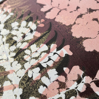
8. Experiment with placement and colours - Try overlapping leaves, creating borders, or arranging botanicals in patterns, rather than random scattering, can push your creativity. I also sometimes refer to a colour wheel looking at complimentary or contrasting colours.
I occationally advise students to think about seasonal colours they enjoy, contemplate what colours resonate with them in their wardrobe, or when they design the interiors of their home.
9. Other prints - Many botanicals will hold enough paint after the first print to create a second, softer impression on a fresh sheet. It's often referred to as a 'ghost print' and these whisper quiet pieces can surprise you with how gently beautiful they are. The plant which has been used as a mask on a first print may also be turned over and used as a stamp with the ink it has collected from the plant.
10. Embrace imperfection and nature - Some of the most beautiful effects come from partial transfers, or unexpected botanical impressions. Surpirse and lack of full control are what brings may printmakers (including myself) joy. In addition to this, the nourishing time you spend in nature collecting plants or when examining a print with its natural marks, is a reason in itself to delve into botanical printmaking.
Let go and enjoy the process, not just aim for outcome.


The Art of Selecting Inks

The choice of ink can truly make your botanical printing journey.
Let me walk you through my four favourite options, each bringing its own unique qualities to your botanical adventures.


Akua Inks
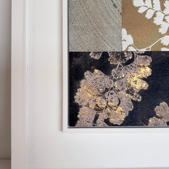
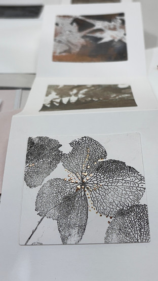
I first discovered Akua inks during a particularly humid summer when everything else was drying too quickly. These water-soluble inks transformed my printing practice. The way they capture the delicate veining of a Japanese maple leaf or the intricate texture of a fern frond is one I return to in my own studio. The bowl below was made with these inks and I love the faded gradeur feeling of the piece, with worn gold on the bowl itself and a fragment of textile which suggests its been treasured for a few generations. I used mask/ stencils ahich I handcut and quite a number of layers to build up the 'historical artefact' look.

Beyond their beautiful printing qualities, they align perfectly with eco-conscious printing practices.
Here's what makes them special:
- Water-soluble nature means toxic solvents are unnecessary
- Extended working time allows for thoughtful composition
- Rich pigmentation creates stunning layers

There's something deeply satisfying about the way Golden OPEN acrylics glide across a gel plate. Their buttery consistency and slower drying time make them ideal for botanical printing, especially when you're working with larger leaves or creating complex layered compositions.
They are ideal for beginners who may not yet be fully aware of the drying time, weather/ temperature issues of particular inks.
I love the metallic range of these inks/paints, but watch out they dry more speedily. My favourite is their bronze version as it is an iridescent gold enhanced with green tones creating a deep bronze finish. Thinned as a wash, it develops an authentic verdigris patina effect which I love.
I remember the first time I used them for a series of fern leaf prints. The way they captured every minute detail while maintaining their workability was nothing short of amazing and I still enjoy that 'Ohhhhhh' sound students make when they see print reveals using it during a workshop.
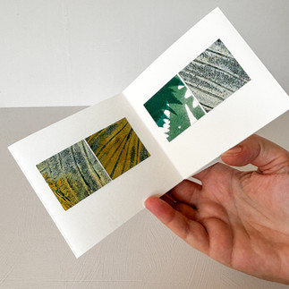
I've now invested time in many an experiement with different inks on varying papers- try mulberry, wet strength, dark papers. Some are ideal for layering in collage, with their translucency. Japanese awagami papers are worth exploration and I regularly go back to smooth drawing paper like this one.

Liquitex Professional Acrylic Ink
When I'm seeking to capture the finest details of botanical specimens, I reach for Liquitex Professional Acrylic Inks. Their fluid nature allows them to settle into every tiny vein and texture, creating prints that feel almost photographic in their detail. My other detail caturing preferred paint is DERIVAN : MATISSE STRUCTURE.

Paynes grey remains my favourite from this range- the blue grey black colour seems to go with every other colour on the wheel and I particularly like its consistency.
Studio Practices
Creating art shouldn't come at the expense of our environment. In my studio, sustainability is woven into every aspect of my printing process. Here's how I approach it:
The Mindful Collection of Botanicals
Before we even begin printing, our relationship with nature starts in the garden or on our morning walks. I maintain a small journal noting where and when I find particularly interesting specimens. This not only helps with future foraging but also ensures I'm not over-harvesting from any one area.


Collection guidelines I live by:
Never take too much of any single plant
Collect from species in abundance, but still be aware of how much you are harvesting
Focus on fallen leaves during autumn
Document locations and seasonal availability
Respect private land and protected areas. Always obtain permission before foraging on private property, and never collect from nature reserves or protected sites without authorisation.
Remember you are in an ecosystem - be mindful of your footsteps on the habitat and examine plants to see you aren't relocating any species of insect etc which calls them home.


Consider cultivation
Growing your own printmaking plants—even in containers—can provide sustainable material while reducing pressure on wild populations.

If you come to a course at our home, you will note that I have three large raised beds where I grow many plants specifically for their printmaking qualities, plus plants that are so beautiful I study them each season from our large barn window.

Taking time to properly prepare your botanical specimens can make the difference between a good print and an extraordinary one.
Look for interesting variations in texture and form - even those with bites, or skeletal leaves, these imperfections often create the most intriguing prints.
Allow leaves to dry completely, then press them between sheets of paper for about 30 minutes. This step helps remove any remaining moisture while ensuring the leaf will lie flat against your gel plate.
Teaching and Learning Together
Nothing brings me more joy than sharing these techniques with others. In my workshops, whether online or in-person, we explore not just the 'how' but the 'why' of botanical printing. We delve into colour theory, composition, and the subtle art of working with natural materials.
Current Workshop Offerings
Join me for an intimate exploration of botanical printing.
My workshops are limited to small groups (up to 4 at my home studio) to ensure personal attention and maximum learning opportunity.
We can agree times and discuss where you are in your botanical journey, so you can have a bespoke workshop. Find out more here. I also run workshops at other venues and you can get in touch should you wish to discuss booking me through this form.
My next long course (5 days) is at Leicester Print Workshop and you can find out more here.


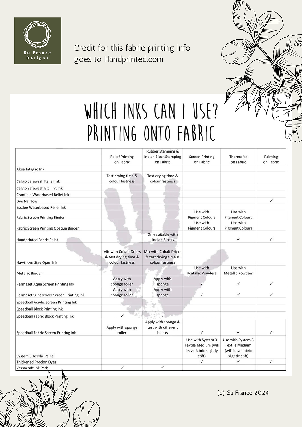
You may also find the below chart useful - I know I have. Happy inky times to you all!

Comments