
Imperfect Pots- From Inspiration To Botanical Collagraph Prints
- Su France
- Aug 10, 2023
- 8 min read
Updated: Dec 6, 2024
Initial inspiration for the Imperfect Pots Prints

A few weeks ago, I sat in my parents house, where I noticed a beautiful wooden vessel, which I had gifted them years before.
There are times when inspiration is immediate and obvious- a line can be drawn or perhaps I should say rolled directly from the 'feeling, season or thing' (or a mixture of these) to the eventual print, but at other times the inspiration comes from so many things and a few , subconscious layers too, which make us who
we are.
Often, inspiration comes from an accumulation of many small moments and impressions - a mosaic of memories and experiences which have shaped me, though I may not be fully conscious of them all. It is the interplay and layering of these forgotten or half-remembered fragments that ultimately gives rise to the image. My art is a distillation of the seasons of my life, filtered through the vague memories and beliefs and transformed into something new. Even I cannot always precisely retrace the meandering route from source to studio to print, but I know that my work expresses what I have seen, felt and what I have become.
As I sat in the armchair, I realised that my current simple pot designs, weren't simply the result of my love of the work of more well known ceramicists and studio potters. I have been admiring or researching the sensibility of beauty in items with cracks, marks which show the intention of the makers hand, beside those marks which happen over time or through happenstance. Some see or even dismiss them as 'imperfect pots'- I feel these marks make them all the more interesting.

Sitting within the comfort of the seat, I listened as mum relayed how she still loved this burr turned bowl.
She also reminded me of the time when we had also visited a pottery festival, where artisans sold their own pieces from stalls within a cowshed - Pots in the Pens- or 'Potfest' - a name of a festival which might in some circles be misconstrued. We didn't see disappointed folk looking for a different type of relaxing way to pass the time, but we always had a great time admiring the work with clay.
I had really admired an extremely reasonable 'second' - (a pot deemed not to be the required standard due to a number of reasons...slight imperfections, glaze flaws, tiny pinholes, blemishes, or glaze runs/drips). It may be an unintended colour or a wonky shape.
Not to personify too much but we all have our flaws and blemishes- and I am definitely wonky side so I have always had an affinity with such seconds (and obviously you can get a bargain). From an early age my mum extolled the virtues of such unique items and now much of our pottery in out home has been bought and treasured as unique seconds.
We were doing the 'once round' at the festival, to look at other offerings in the heavily scented cow pen, when I decided to go back and spend my £7 - it seemed much more back then on the little raku bowl. Sadly, when I returned to the stall, my little pot had gone, already sold to a lucky buyer.
My folks didn't let me wait too long before I discovered the sweet little vessel, carefully newspaper-wrapped, in the boot of their car, waiting for me to be delighted.
It's years ago that surprise and sadly the pot came to a mosaic-like end, however it's the associated narrative which now feels so precious.
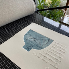
My Studio Printed Pots


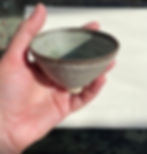
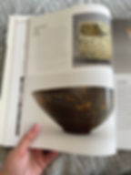
I do still love pots and not only bought a studio pot recently, (the one in the first image) which was cheap as the maker is unknown, but I have also been reading from books and old exhibition pamphlets, about ceramicists whose work really resonates.

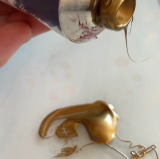
The inks I use for many my collagraphs include Cranfield etching ink (available through Jacksons, here)
and their relief ink available through Jacksons, here)*
This innovative new line of oil-based inks can be washed away simply using liquid soap and water, without requiring harmful and often earth costlier solvents. Ideal for printmakers seeking a safe and less-toxic alternative.
These "Caligo Safe Wash" inks have been formulated for relief or etching printing processes and includes (here's the print nerd part) a modified oil, a transparent extender, and a tack reducing compound, to assist with wiping. In fact with my collagraphs I tend to ink up with an intaglio method and then sometimes do a relief roll over to brighten the piece, using two different types of ink in the piece.
So if you're interested in adopting a more environmentally responsible approach, these help me achieve the colours I prefer, while being less toxic- and without spending excessively on solvents. A clever innovation in my estimation!
For some collagraphs I use Aqua inks (available here). They are a soy-based ink which is made with high quality lightfast pigments. The inks have a thick consistency (but I do sometimes modify them) with minimal water content and contain no toxic driers for a longer working time. Again, the ink cleans up easily with a dry rag, followed by soap and water.
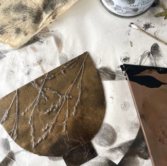
You might spot in the image below that although I make some of my own mark making tools, from found objects and kitchen utensils, I also use a roulette set of tools, with steel ends, which quickly make multiple scratches on collagraph plates- great for creating a 'tooth' for the ink to catch. They are available, here.

Update: while I do use a scalpel for much of the cut and scratch work I do as a collagraph printmaker I have also found these less dangerous ceramic blades to be really useful, particularly when I'm teaching others this printmaking technique.
Theyre 'slice' blades and you can find them here.
Replacement blades are also available here. Personally, I prefer the more pointed, rather than the rounded blades and as of yet they have stayed sharp and I havent needed to swap a blade and after a few months of use thats pretty impressive!
For full transparency, I do get an affiliate commission but the price remians the same for you.


I first saw the ceramic pieces of Lucy Rie at Kettles Yard in Cambridge where she donated works which demonstrate her innovative glazing techniques and the minimalist aesthetic I love in pottery. They are delicate yet simple. From an admiration of Rie as an influential studio potter, I then was led to the work of Gertrud Vasegaard and discovered there had been an exhibition of their work, together.
I managed to get a copy of the catalogue and am rather taken with black and white photos of them both; two strong, female artists, staring back at me giving me permission in my early 50's to celebrate my own creativity.

“A ceramic bowl can constitute an optical and physical praise of the world – a homage to the heart of existence. One bowl by Rie or Vasegaard can express more than it means, as if it were the sum of all bowls.” — Professor Henning Jørgensen
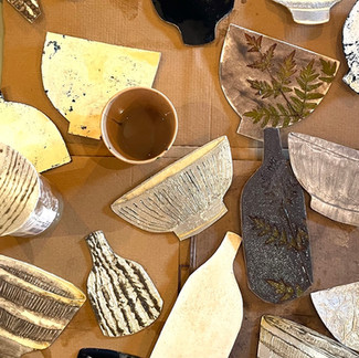
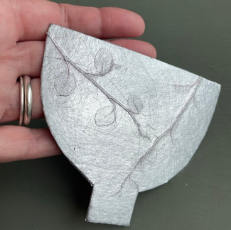
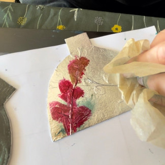
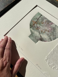
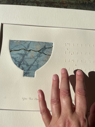
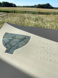
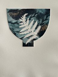
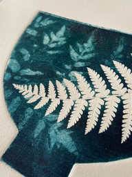
My own pots, realised in paper form, are sometimes inspired in shape by their more famous counterparts, but for me they're decorated with botanicals or textures which I have developed, so as to make the designs truly 'mine.'
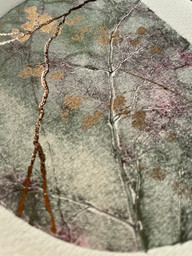
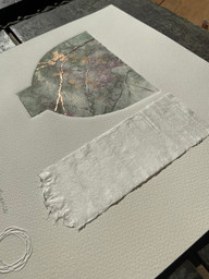
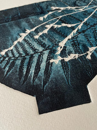
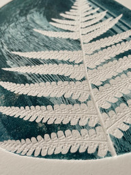
With the collagraphs, textures with different depths absorb ink in unique ways and produce an array of tones when printed. Any low relief materials can be adhered to the plate, including thin stems, leaves, fabrics, tapes, and threads. I add textures with carborundum and aluminium tape and have gone into more detail about my method of collagraph making in my blogpost, So... What is a collagraph print and how do you print your pebbles? Do you slice up rocks? which was written after I was asked that very question, at Nottingham Contemporary's Print Fair.
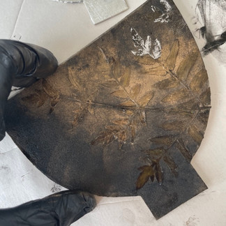
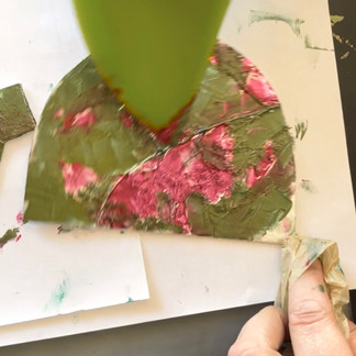
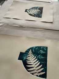
Once the print plate is completed, the collagraph plate is sealed with varnish and is then printed, using intaglio or relief methods.
With collagraphs, you aren't limited to just relief printing where the ink sits on the raised areas. You can also ink the plates intaglio-style, filling the crevices with colour while the surfaces stay blank. But the real magic happens when you combine both - intaglio ink in the crevices, topped with a second shade rolled across the reliefs. The resulting interplay of hues and textures is an absolute marvel and one of my favourite parts of the collagraph process. Experimenting with multiple inking techniques opens up a world of opportunities to blend colours in new and exciting ways.
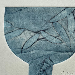

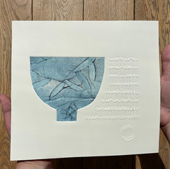


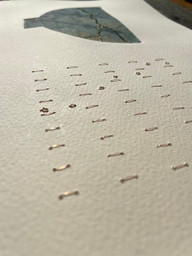
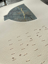
Each printed pot is unique. On one I'm impelled to leave space, others to mindfully stitch in linen or gold. With others, I print just a simple pot, some are further embellished with golden lines, using Japanese gold thread which has a lovely subtle sheen.


My aim is in part to mimic the Japanese art of kintsugi.
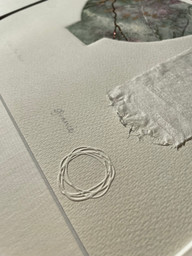
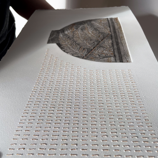
Kintsugi is the Japanese art of repairing broken pottery by mending the areas of breakage with lacquer dusted or mixed with powdered gold, silver, or platinum. The philosophy behind it is to recognise the history or possible damage of the object as part of its aesthetic value, rather than disguising them. How poetic! This is the reason my prints have gold elements- in foil or thread, while the marks made and the blind embossing is to give a sense of space, an exhale.
Paper
I love St Cuthbert's Mill for paper because of their exceptional quality, its local, from the UK and there's a diverse range of papers tailored to my needs. This is why I needed to buy a new plan chext this year!
I particularly favour their Somerset Newsprint for blind embossing. This paper excels at capturing intricate details, resulting in a beautifully moulded 3D effect. The embossed designs stand out wonderfully against the paper's subtly muted hue, creating a sophisticated and visually appealing contrast.
The textural nature of their Somerset Velvet paper is remarkable and aptly named. Its gentle surface provides an ideal foundation for many of my techniques, offering a perfect balance between tooth and smoothness.
For collagraph printing, I often find myself reaching for their Somerset Satin. This paper was a later discovery in their range for me, but I'm gravitating towards it more and more. Its smooth surface and ability to render fine details make it an excellent choice for my more complex pots.


Buy my Printed Pots here.
Limited edition giclee prints may be bought here.
Let me know what you think...
I always love to hear your feedback on new designs. Please comment below or get in touch. To hear about my new work, exhibitions and events, join my mailing list.
About the author
Su France is a Lincolnshire based botanical artist. Much of her work depicts the beauty found in nature, including plants she grows and responsibly forages, on the farm where she lives. The simple joy of finding pebbles, on broken coastlines, is another of Su's inspirations and her aim is for her prints to evoke a sense of calm or rekindle memories.
Su loves exploring the British countryside on foot, camera in hand, capturing ideas for her next botanical prints. Back in her garden studio, Su creates modern, simple intaglio prints based on her photographs, or forms collagraphs or solar plates, sometimes using the botanical itself to directly print from. She hand prints with a Gunning etching press, using environmentally-friendly water and oil-based inks. She selects these because they are non-toxic inks that can be washed away with liquid soap and cold water, instead of using solvents.
Su's prints are original mono prints (one offs labelled A/P or 1/1) or limited editions with the number/ followed by the edition size.


Take me to the giclee limited edition prints of ceramic vessels
You may also want to read another blog post on my collagraph plates and mark making linked to 'field marks.'
*For transparency, I receive a small commission if you purchase through my affiliate links.